Monday, April 24, 2017

Assignment 5

Part 1

The goal of this part of the assignment is to be able to use SPSS statistical software to run correlations and make correlation matrices, and interpreter the results.

Figure 1 shows a correlation matrix made using SPSS, which shows the correlation between different racial groups, median household income and job sectors.

For context, the data categories were as follows, all from Milwaukee County:
White - White population for the Census Tracts
Black - Black population for the Census Tracts
Hispanic - Hispanic population for the Census Tracts
MedInc - Median Household Income
Manu - Number of Manufacturing Employees
Retail - Number of Retail Employees
Finance - Number of Finance Employees

Figure 1 - Correlation Matrix made using SPSS, showing correlation between race and job sector in Milwaukee, Wisconsin.


Using the above chart, and a significance level of 95%, we can reject the null hypothesis (that there is no correlation between two variables) where the matrix shows the significance to be anything below .05. If the significance is greater than this value, we must fail to reject the null hypothesis. We can also use SPSS's star rating system to find out if there is a correlation between variables - one star (*) indicates that the correlation is significant to 0.05 level, while two start (**) indicates there is a stronger correlation between the variables - one which is significant to the 0.01 level, or 99% confidence.

From the results, we can see that there is a correlation between the number of manufacturing jobs and retail employees, and finance employees. Likewise, there is a correlation between the number of financial employees and retail employees.

In the financial sector, there is a positive correlation between white people and number of finance employees, and a negative correlation between black and hispanic people and finance employees. This could be because of societal prejudice against black and hispanic people in Milwaukee county, and could also be due to the fact that less people from these racial groups have access to the higher education opportunities that would allow them to become employed in the financial sector.

Interestingly, there is a negative correlation between the number of black people in a census tract and the number of white or hispanic people in the census tract. Milwaukee is well known to be the most racially segregated city in the United States, and these statistics seem to hold true to this. This suggests that areas of Milwaukee where the black population live tend to be majority black areas. There is, however, a positive correlation between the number of white people and hispanic people in Milwaukee census tracts, which suggests that the African American population in Milwaukee is more segregated than the White or Hispanic populations.

Part 2

For the second part of assignment 5, we were asked to prepare a report for the Texas Election Commission.

Introduction

The Texas Election Commission (TEC) has tasked us with analyzing election data from the years 1980 and 2016, based on election turn out and percentage democratic vote, in order to establish whether or not patterns exist. Furthermore, they have requested that we look into settlement patterns of Hispanic people from the 2015 census, to see if there is any pattern between this and the voter turnout and percent Democrat vote. This will allow us to see how the distribution of Hispanic populations affects elections in Texas, as well as how voting patterns have changed in the state over the thrity-six year period between 1980 and 2016.

Methods

Results were achieved using data provided by the TEC showing voter turn out and percent Democratic vote and data downloaded from the US census bureau's 2015 concerning the Hispanic population in Texas counties.

SPSS software was used to create a correlation matrix with the data provided by the TEC, to give a preliminary indication of whether or not there has been a change in election patterns between the 1980 election and the 2016 election. SPSS was also used to look for a correlation between the percentage Hispanic population and the 2016 election data they provided.

To give spatial context to these results, GeoDa was used to create Local Indicators of Spatial Autocorrelation maps, otherwise known as LISA maps. These maps are based on the principal of Moran's I, which compares the values of a variable at one location, in this case within a county, to the value of the same variable at another location. When displayed on a LISA map, this can give a clear indication where clustering occurs. The LISA mpas were created using a shapefile for Texas counties downloaded from the US Census Bureau.

Results

Figure 2 shows the correlation matrix for the voter turn outs and percentage Democrat vote from the 1980 and 2016 elections.
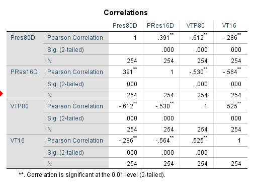
Figure 2 - correlation matrix showing the strength of correlation between the voter tun out and percentage democratic votes from 1980 and 2016.
Using a two tailed test at 95% significance, we can see there is a positive correlation between voter turn outs of 1980 and 2016 (.525) . This suggests that in areas where there was a high voter turnout in 1980, this pattern has continued into 2016 and vise versa.

There is, however, a negative correlation between voter turn out and percent Democrat vote for both the 1980 and 2016 elections (-.612 and -.564 respectively). This indicates that as voter turnout increases, the percentage of votes won by the Democrats decreases. This suggests that between 1980 and 2016, the voters of Texas have been more likely to vote Republican.

To see how Hispanic voters affected this in the 2016 election, a correlation matrix was created using the 2016 data provided by the TEC and the data taken from the 2015 census to illustrate this (Figure 3).

Figure 3 - Correlation Matrix for Percent Democrat Vote 2016, Voter Turnout 2016 and Hispanic Population recorded during 2015 census across counties in Texas.
We can see that there is a strong positive correlation between the Hispanic population in Texas (column HD02_S02 on in figure 3) and the percent democratic vote for 2016. This suggests that the higher the percentage of Hispanic people in a county, the higher the democratic vote. There is a negative correlation between voter turnout and Hispanic population, which suggests that as the Hispanic population in a county goes up, the voter turnout goes down. This could suggest that Hispanic people are unlikely to vote in presidential elections.

In order to give spatial context to these results, GeoDa was used to look for clustering.Figure 4 shows the percentage democratic vote in 2016, while figure 5 shows the percentage democratic vote for 1980.

Figure 4 - LISA Map showing spatial auto-correlation of percentage democratic vote from the 2016 Texas presidential election.
Figure 5 - LISA Map showing spatial auto-correlation of percentage democratic vote from the 1980 Texas presidential election.

In the maps above, blue indicates that these are counties with high democratic votes surrounded by other areas of high democratic votes. The red indicates counties with low democratic votes surrounded by other counties of low democratic votes. The pale blue and red indicate that these counties are not similar to their surrounding counties. The grey counties do not have a significant spatial auto-correlation. This is illustrated in the legend GeoDa produces to go alongside the spatial auto-correlation maps (Figure 6).
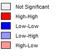
Figure 6 - LISA Map Legend
It can be seen that since 1980, the democratic vote has remained high in the most northernly counties in Texas, and low in the most southern. However, there is no longer a significantly low number of democratic votes in the eastern area of the state that was significant during the 1980's, and the area of strong democratic support in the 1980's on the western border has become less significant and democratic strength has shifted east. This indicates that while some voter patterns in terms of the number of democratic votes have remained similar to 1980, this has not been true across the state as a whole.

Next, the following figures 7 and 8 show the spatial auto-correlations of the voter turnout across Texas for the years 2016 and 1980 respectively.
Figure 7 - LISA Map showing spatial auto-correlation of voter turn out across Texas counties for the 2016 Presidential election.

Figure 8 - LISA Map showing spatial auto-correlation of voter turn out across Texas counties for the 1980 Presidential election.

From figures 7 and 8, we can see that the south of the state has a consistently high voter turnout, as indicated by the dark blue color of the counties here. This has remained consistent between 1980 and 2016, and is also an area where the percentage Democratic vote has remained consistently low between 1980 and 2016, which suggests that this area of the state is a Republican stronghold.

The rest of the state does not show any areas that indicate a strong pattern between 1980 and 2016, aside from the are north of the aforementioned Republican stronghold, where votes are low and have remained consistently low.

Next, the voter turnout and percentage democratic vote was compared with the Hispanic population of the state (Figure 9).

Figure 9 - LISA Maps showing, from left to right:  Percentage democratic vote, 2016; Voter Turnout, 2016; and Hispanic Population, 2015. 

From the comparison above, we can see the most prominent area of high Hispanic population is the cluster of dark blue counties in the east of the state. where the dark blue indicates that these counties have a high Hispanic population and are surrounded by other counties with high Hispanic population. However, this area on the percentage democrat vote map and voter turnout map is predominantly grey, indicating that there is no significance. This suggests that the Hispanic population did not have much of an influence on the election results in Texas in 2016, whereas the areas of the state with low Hispanic population along the south west border have low numbers of democrat voters and high voter turnout, will have had more influence on the outcome of the election.

Conclusion

While spatial patterns are evident between the voter turnout and percentage democrat votes in Texas, as can be see from both the SPSS correlation matrix and the LISA maps, the Hispanic population do not appear to have a significant impact on the result of elections, as shown by the grey colour on the LISA maps that indicate areas of high Hispanic population are not significant in terms of democrat votes. This is despite the fact that the SPSS correlation shows there is a positive correlation between the number of Hispanic people in a county and the percentage Democrat vote. This suggests that despite Hispanic people being more likely to vote Democrat, they do not have much of an influence on the overall outcomes of elections.

Sources
http://www.governing.com/topics/politics/gov-milwaukee-most-segregated-polarized-place.html
US Census Bureau.
Texas Election Commission.

Wednesday, April 5, 2017

Assignment 4


Part 1: Z and T Tests


1. The following table shows the z and t values associated with various hypothetical tests, which are either one or two tailed and have varying confidence levels.


Interval Type Confidence Level                  n               a  z or t? z or t value
A Two Tailed 90 45 0.05  Z 1.65
B Two Tailed 95 12 0.025  T 2.201
C One Tailed 95 36 0.05  Z 1.65
D Two Tailed 99 180 0.005  Z 2.58
E One Tailed 80 60 0.2  Z 2.06
F One Tailed 99 23 0.01  T 2.508
G Two Tailed 99 15 0.005  T 2.977

2.  An organization from the Kenyan Department of Agriculture and Live Stock Development has created estimates for the yields of Ground Nuts, Cassava and Beans in a certain district, based on the average yields of the country as a whole. Per hectare, it is expected that 0.57 metric tons of groundnuts, 3.7 metric tons of cassava and 0.29 metric tons of beans can be produced. 

To test whether these estimates are realistic, a survey of 23 farmers was carried out. The results were as follows 


      μ              σ
                  Ground Nuts  0.52         0.3
                  Cassava          3.3           0.75
                  Beans             0.34         0.12

To see whether or not these results were statistically different from the average yields from the three crops mentioned above, hypothesis testing was carried out. 

Ground Nuts

Null Hypothesis: There is no difference between the average yields of ground nuts in the selected area and the average yields for the country as a whole

Alternative Hypothesis: There is a difference between the average yields of ground nuts in the selected area and the average yields for the country as a whole. 

Statistical Test: A T test, or Student's T test was chosen to perform the statistical analysis, due to the fact that this type of test is better suited to samples with a small number of observations, and here our number of observations is below thirty as only 23 farmers were sampled. 

Confidence Level: For all three tests, a confidence level of 95% was chosen. As we are conducting a two tailed test, the alpha level is 0.025. This means the critical value, based on 23 degrees of freedom, will be ±2.069 Thus, for this test and the two that follow, a T test result of less than 2.069 but greater than -2.069 will cause us to fail to reject the null hypothesis, meaning that there is no statistical difference between the average yields for this particular area compared to Kenya as a whole. If the result does fall to either side of the critical values rather than between them, we must reject the null hypothesis. This means that there is a statistical difference between the average yields in this area compared to Kenya as a whole. 

T test result: -0.365.

Conclusion: This result is lower than the critical value of 2.069, but greater than -2.069, meaning it does not fall within either of the two tails. Therefore, we must fail to reject the null hypothesis. The probability of this result occurring is 35.94%

Cassava

Null Hypothesis: There is no difference between the average yields of cassava in the selected area and the average yields for the country as a whole

Alternative Hypothesis: There is a difference between the average yields of cassava in the selected area and the average yields for the country as a whole. 

Statistical Test: T test.

Confidence level: 95%

T test result: -2.564

Conclusion: The result of -2.564 is less than the critical value of -2.069 on the left tail. Therefore, we must reject the null hypothesis. The probability of this result occurring is 0.54%

Beans

Null Hypothesis: There is no difference between the average yields of beans in the selected area and the average yields for the country as a whole

Alternative Hypothesis: There is a difference between the average yields of beans in the selected area and the average yields for the country as a whole. 

Statistical Test: T test.

Confidence Level: 95%

T test result: 1.998

Conclusion: This result is lower than the critical value of 2.069 but greater than -2.069, meaning it does not fall within either of the two tails. Therefore we must fail to reject the null hypothesis. The probability of this result occurring is 2.33%

In light of these results, it is clear than while there is no statistical difference between he average yields of beans and ground nuts in the particular area when compared to the country as a whole, is a statistical difference between the amount of Cassava produced. The T test result falls within the left tail, and is negative, meaning that there is statistically less cassava produced in each yield in this part of the country compared to Kenya as a whole. This means that it may be difficult for farmers in this area to get close to the estimated cassava yield provided by the Department for Agriculture and Live Stock Development. This could be due to changes in soil quality or climactic conditions in theis area that do not favor the growth of cassava, resulting in smaller yields for farmers here.

3. As a researcher suspects the level of pollutants in a particular stream to be higher than the allowable level of 4.2mg/l, 17 samples were taken, and from these a mean pollutant level of 6.4mg/l were found, with a standard deviation of 4.4. Hypothesis testing was carried out to find out if this sample was statistically different from the rest of the stream.

Null Hypothesis: There is no difference between the levels of pollution in the sample and the rest of the stream.

Alternative Hypothesis: There is a difference between the levels of pollution in the sample and the rest of the stream. 

Statistical Test: A T test shall be used, as we have a relatively small sample size of 17 and this test is better suited to small samples than a Z test.

Confidence level: 95%. This is a one tailed test, so the alpha level is therefore 0.05. Based on 16 degrees of freedom, this means that the critical value is 1.746. If the calculated test result is greater than this value, we will reject the null hypothesis. If it does not exceed this value, the we will fail to reject the null hypothesis.

Test results: 2.062

Conclusion: As the test result of 2.062 is greater than the critical value of 1.746, we must reject the null hypothesis. This means that statistically, the samples taken from the stream are more polluted than the allowable level of 4.2mg/l. 

The probability of this value is 1.97%

Part 2

For this part of the assignment, we are looking to find out whether or not there is a statistical difference between the home values in Eau Claire City block groups, compared to all of the block groups in Eau Claire County.

To do this, hypothesis testing was carried out, as follows:

Null Hypothesis: There is no difference between the average house values of homes in Eau Claire City block groups compared to the block groups of Eau Claire Country as a whole.

Alternative Hypothesis: There is a difference between the average house values of homes in Eau Claire City block groups compared to the block groups of Eau Claire Country as a whole.

Statistical Test: A Z test was chosen as the appropriate statistic, This is due to the fact that we have a sample size of 53, as there are 53 block groups in Eau Claire city. This shall be a one tailed test. 

Confidence Level: 95%. As this is a one tailed test, the alpha level is thus 0.05. From this, we can figure out a critical value of 1.65. If out test statistic exceeds this, we must reject the null hypothesis.

Test result: 2.572.

Conclusion: As the test result of 2.572 is greater than the critical value on 1.65 associated with our one tailed test, we must reject the null hypothesis. This means that the value of houses located within the block groups that make up the City of Eau Claire is statistically different from the value of houses in the rest of the county.


Figure 1 - Map showing the block groups of Eau Claire by average house value, with City of Eau Claire block groups in bold.

From figure 1, it is clear that many of the block groups within the City of Eau Claire have a lower average property value, particularly as the block groups get smaller in the central business district area. This could be because properties here tend to be smaller, and those in urban areas are likely to have less green space and could lack other amenities such as parking availability if they are apartments. Furthermore, the area is also the location of both the University of Eau Claire and Chippewa Valley Technical College. This means that many of the properties are student rentals, and are not as well maintained as other homes. This would drive down the value of the property compared to those properties not intended to be student rentals. Lastly, this area is also in the vicinity of the Chippewa River, which runs through the city's downtown area. Properties that fall within the potential flood plain of the Chippewa River will also be likely to have lower values due to the potential for future floods and preexisting flood damage. 


Wednesday, March 8, 2017

Assignment 3

Introduction

Council officials in Dane County, Wisconsin have noticed an increase in foreclosures between the years 2011 – 2012 – where a mortgagor fails to keep up with their payments, resulting in their property being repossessed. The aim of this report is to look for spatial patterns in the foreclosures, as well as predict whether or not there will be a further increase in foreclosures in 2013.


Figure 1 - Numbered Census Tracts in Dane County, Wisconsin, with test tracts outlined in red

Methodology

Using data showing the number of foreclosures per census tract within Dan County in 2011 and 2012, a map was created to show the areas of the county in which the number of foreclosures either increased or decreased. Preexisting data showing foreclosure numbers in both 2011 and 2012 was used to figure out how 2012 numbers differed from those observed in 2011.
Three test tracts were randomly chosen, from which the Z-scores of the number of foreclosures in both 2011 and 2012 were measured. The chosen tracts (122.01, 31 and 114.01) are highlighted above in figure 1.
A Z-score is used to locate the exact position of an observation on a standard deviation curve relative to the mean, so that exactly how many standard deviations away from the mean it lies can be known. This is useful, as from this probability can be derived of how likely this result was to occur. Z-score calculations can also be utilized to answer questions that help make predictions for the future: for instance, what number of foreclosures will be exceeded 50% of the time?


Results
Figure 2 - Changes in foreclosures, from 2011 to 2012, in Dane County census tracts.

 Figure 2 shows the changes in foreclosure numbers between 2011 and 2012 in Dane County. We can see that while there was a total of 1219 foreclosures in 2011, and 1316 in 2012, the number of foreclosures actually fell in many census tracts, particularly in Tract 113.02 in the north of the county, and Tract 5.04 in the center. Areas where the number of foreclosures fell are illustrated in blue on this map. There are however, many tracts where the number of foreclosures increased in this time, notably in the large Tract 129 in the north west and 119 in the east.
Figure 3 - 2011 Foreclosures by census tracts, Dane County, Wisconsin

If we compare these changes to the map in Figure 3, which shows the number of foreclosures by census tract in 2011, we can see that while some tracts that experienced a lot of foreclosures in 2011 saw an increase in 2012, this is not the case for all tracts – some of those, such as Tract 132 in the north of the county, has a high number of foreclosures in 2011 but saw a decrease in 2012. Furthermore, just to the east of Tract 132 is Tract 129, which in 2011 had a low number of foreclosures that rose sharply in 2012. These instances do seem to be anomalies, however, as the majority of tracts with higher numbers of foreclosures in 2011 saw an increase in 2012, as can be seen by comparing the smaller tracts in the center of the state from both Figure 2 and 3. Likewise, most of the tracts that had low numbers of foreclosures in 2011 saw a decrease in 2012, as illustrated by the tracts in the south west of the county.


Part 2 – Z-Score Results

2011
2012
Tract 122.01
-0.614
-0.636
Tract 31
1.437
0.576
Tract 114.01
2.384
2.695
Table 1 – Z-Score results for selected census tracts, for 2011 and 2012.

From the results above, we can see that for these three tracts, despite the overall rise in foreclosures within the county as a whole, the relative position on the standard deviation curve of these tracts has not changed drastically. The results for Tract 31 emphasis the fact that the rising number of foreclosures hasn’t affected all tracts in the county equally, as here the 2012 value of 24 the previous year dropped to 2012.
Based on the mean for 2012 across all of the census tracts of 9. 906 foreclosures, and the standard deviation of 8.776, there is a 70% probability that there will be over 16 foreclosures in any given county. There is a 20% chance that the number of foreclosures will be above 19. If this occurs, it is likely to do so in the tracts such as 120.01, just west of test tracts 31 and 114.01 (see figure 1). This tract can be seen to have a recorded a high number of foreclosures in 2011 from figure 3, and then proceeded to experience a large increase on this in 2012, as can be seen in figure 2. If this pattern of growth is to continue, it is likely that it would do so in this location.

Conclusion


From the data, we can see that growth in foreclosure numbers was not consistent across the county, but limited to certain tracts. The spatial pattern therefore seems weak, however if growing foreclosure numbers is to continue past 2012 there is a 70% chance of foreclosure numbers above 16 will be observed in the census tracts. It is clear from figures 2 and 3 the number of foreclosures in tracts are variable in most circumstances, however notable areas such as tract 120.01 have experienced high growth on already relatively high numbers of foreclosures. This could be due to changing economic circumstances after the 2008 financial crash, which has caused many redundancies and wage cuts which could explain why the numbers of foreclosures are so variable and not confined to one area of the county – perhaps a more deprived area, for instance.